The Basics of Color Theory
Color theory is the foundation of any strong visual identity. If you care about aesthetics (and if you're here, you definitely do), understanding how colors work together can completely transform your Instagram presence.
Whether you're a brand, influencer, photographer, or indie creator, mastering color theory helps you:
- Build a cohesive Instagram feed
- Strengthen brand recognition
- Evoke specific emotions
- Stand out in a crowded scroll
Let’s break it down in a practical, creator-friendly way.
The Color Wheel
The color wheel is your best friend when it comes to choosing harmonious color combinations. Think of it as the map behind every beautiful feed you’ve ever saved.
It consists of:
- Primary colors: Red, blue, and yellow
- Secondary colors: Green, orange, and purple (created by mixing primary colors)
- Tertiary colors: The six combinations of primary and secondary colors
From this wheel, we get powerful color relationships:
Complementary Colors
Colors opposite each other on the wheel (e.g., blue & orange).
They create strong contrast and bold visuals — perfect for high-impact posts.
Analogous Colors
Colors next to each other (e.g., blue, teal, green).
They create harmony and a smooth, calming aesthetic.
Monochromatic Colors
Different shades and tints of the same color.
Minimal, elegant, and very popular among lifestyle creators.
Understanding these relationships allows you to intentionally design your Instagram feed — instead of just posting randomly.
Why Color Theory Matters for Instagram
Instagram is visual first. Before someone reads your bio, checks your highlights, or scrolls your captions, they see your grid.
And what do they notice first?
Color.
A cohesive color palette makes your feed:
- Instantly recognizable
- More professional
- Emotionally consistent
- More shareable
When your colors work together, your profile feels curated — even if your content is spontaneous.
"Color is a power which directly influences the soul." — Wassily Kandinsky
That emotional influence is exactly why color matters so much in social media aesthetics.
Choosing the Right Instagram Color Palette
If you're serious about improving your Instagram aesthetic, here’s a simple framework:
1. Analyze Your Current Feed
Start by understanding where you are.
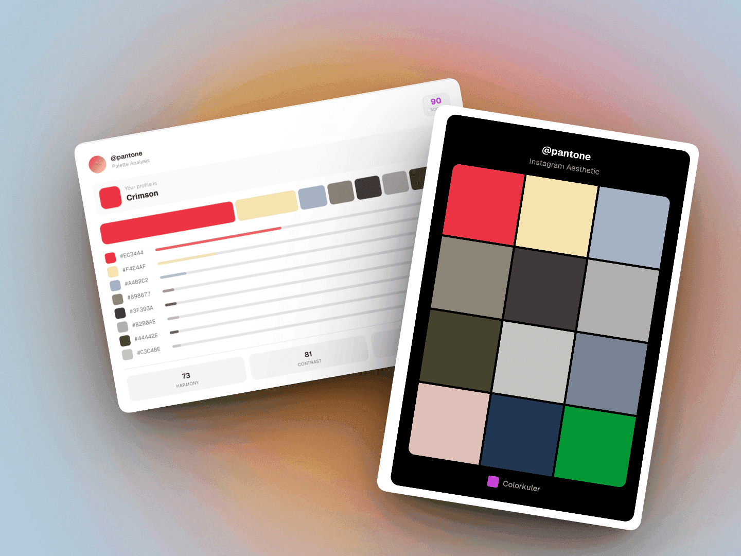
Use a tool like Colorkuler to extract your dominant colors. You might discover patterns you didn't even realize were there.
Ask yourself:
- Are my colors warm or cool?
- Is there one dominant color?
- Do my posts feel chaotic or cohesive?
Clarity comes from measurement.
2. Identify Your Dominant Colors
Most strong Instagram feeds rely on:
- 1–2 dominant colors
- 1–2 supporting colors
- 1 neutral (white, beige, gray, black)
For example:
- Travel creators → earthy browns + sky blues
- Minimal lifestyle → beige + soft whites
- Tech/creative → black + bold accent color
Your dominant colors should reflect your personality and niche.
3. Build a Palette of 3–5 Complementary Colors
Keep it simple.
Three to five colors are more than enough to create visual consistency without feeling repetitive.
You can use:
- Complementary schemes for bold feeds
- Analogous schemes for soft, cohesive vibes
- Monochrome schemes for minimal elegance
Consistency doesn’t mean boring — it means intentional.
4. Plan Your Grid Before Posting
Instead of thinking post-by-post, think grid-by-grid.
Before publishing:
- Look at how the new post fits next to existing ones
- Check color balance across rows
- Avoid stacking the same dominant color repeatedly
Even small adjustments can dramatically improve your overall aesthetic.
Common Mistakes to Avoid
Here’s what usually breaks visual consistency:
- Posting without a defined palette
- Overusing filters that shift colors unpredictably
- Mixing warm and cool tones without intention
- Ignoring lighting consistency
Color inconsistency creates subconscious friction. Harmony builds trust.
Final Thoughts
Color theory isn’t just for designers — it’s for creators who care about impact.
When you understand how colors interact, you stop guessing and start designing your Instagram presence with intention.
If you want to instantly discover the dominant colors in your feed and build a more cohesive aesthetic:
Your grid deserves to look as intentional as your ideas.